
Featured Local Artists
A collection of multi-disciplinary artist from Northumberland and surrounding counties.
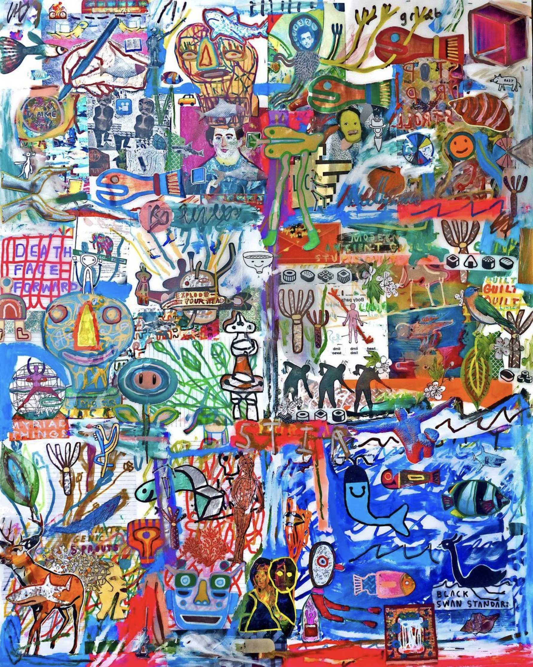
Oli Goldsmith
My works embrace a playful sense of “controlled accident” (as in calligraphy). Something akin to abstract expressionism, though through a hyper-mixed media palette.” - Oli
Work: ‘Death Face Forward’ © O Goldsmith - SOLD

Alexandra Peters
In my work I explore and challenge the natural world in relation to human environments. I do this by constructing a narrative of nature invading personal space. By situating living plants and organisms into these somber and strange human surroundings, I am able to create a visual metaphor for the seemingly emotionless figures that I depict. By juxtaposing these characteristics, I produce a sense of two different moments being created simultaneously. - AP
Work: ‘Embodied Mind’ © A Peters

Fiona Crangle
Art history is told largely through the viewfinder of cisgendered male artists, women objectified in their male gaze. In appropriating art history, I put into play the politics of looking and being looked at. I collaborate with sitters to increase their agency and amplify their voice as a woman looking at women, telling women’s stories. - FC
Work: ‘Maia, Ironing’ © F Cragle - SOLD

Herb Jung
I like to paint with soft body acrylics as it allows me to paint in thin transparent layers and to use drawing techniques (like crosshatching or washes). Soft body paints are also forgiving and allow me to slowly build and imitate the textured impasto look of heavy body acrylics. For a change, I will do mixed media pieces, ripping pages from old books, gluing them to the canvas and using the text to create the illusion of depth and hidden meaning. - HB
Work: ‘New Bloom’ © H Jung
Inuit Art from Cape Dorset, Nunavut
From Leslie Boyd, curator: Inuit artists have their own very distinct individual styles, techniques and approaches to their art making. Themes and subjects tend to be more specific to their environment and lifestyle. Arctic animals, the land and family are typical subjects, for both the older and newer generations.
Work: ‘Passing Char’ © N Teevee - SOLD

Jana Ewart
When I first started to paint, I tried to reproduce what I saw, so my work and colours were realistic. Everything changed while painting the rugged landscape, red soil, adobes and big skies of the high desert of New Mexico. I was no longer constrained by realism. I felt free to experiment with bold colours and bold brushstrokes. My work has grown from there. - JE
Work: ‘Birches’ © J Ewart - SOLD

Judy Hopkins
My preferred palette is made up of earth tones, which I find lend themselves beautifully to my rural themes. In my landscapes the time of day and light source dictate the lighting. Tints on tones and contrasting values can create dramatic areas of light and dark that help direct the viewer’s eyes through the painting. - JH
Work: ‘Back of King Reimagined’ © J Hopkins - SOLD

Sarah Phelps
The majority of my creative process is intuitive. I typically choose a colour palette in advance based on how I'm feeling, but as I paint I may introduce new colours and the palette can change. It's like a force takes over and I go with it. When painting the ocean-inspired piece Expansion, I chose the blues and greens in advance to represent water, but it wasn't until the last minute (when a scene emerged) that I unexpectedly added orange to represent the sun. I also knew in advance I'd be using my silicone/blow drying technique so I could create water bubbles and flow. - SP
Work: ‘Expansion’ © S Phelps

Kelly Kirkham
Play is a recurring theme in my work. I love creating make-believe worlds with objects like puppets, small toy-like sculpture, and fantastical landscapes and creatures. I love the connection with our child selves and how we all come with play memories that may interact in novel or nostalgic ways with my pieces. - KK
Work: ‘Howl Marionette’ © K Kirkham
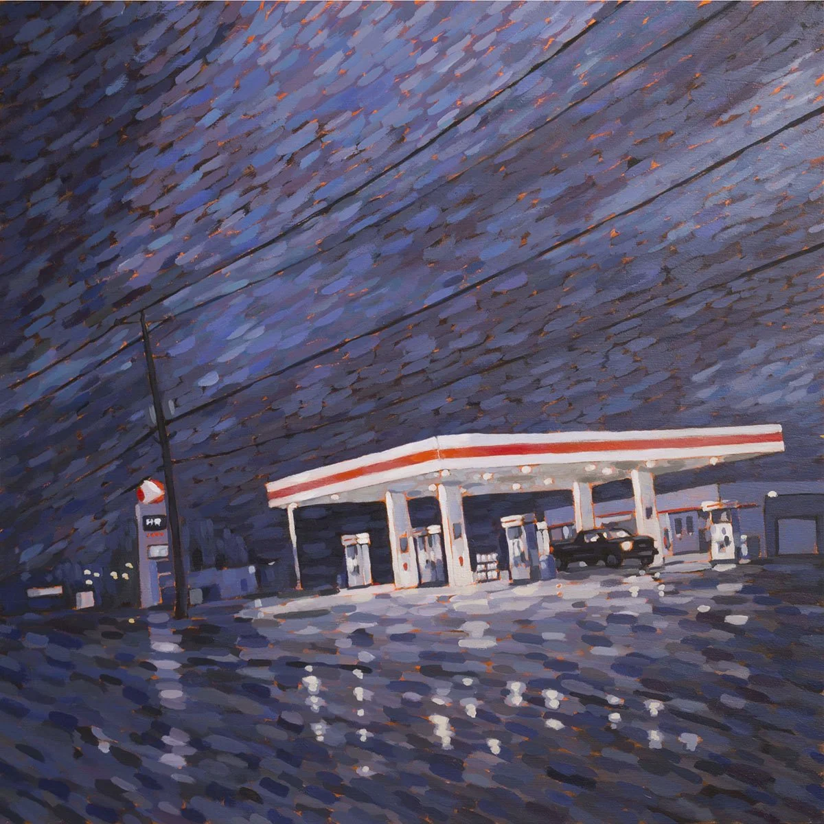
Luke Despatie
My subject matter is inspired by my daily travels around Northumberland County. Some scenes are mundane, some are strikingly beautiful, some are both – I want to express all of those things in my work. My style started as a way to represent glistening snow in an early ice fishing hut painting, but evolved into a technique that’s wonderful at capturing vividly expressive skies that have a real sense of movement. - LD
Work: ‘Rest Stop’ © L Despatie

Melanie Browne
Sometimes I don't discover my subject until partway into a painting. I'll have a little 'aha' moment and realize what the painting is about. Perhaps it's the turn of a leaf, a colour relationship, a repetition of shapes. It could be anything that speaks in the language of painting. - MB
Work: ‘Four Roses’ © M Browne - SOLD

Nigel Dickson
I create a new photograph series every year or so, so that I still feel I can call myself a photographer. The inspiration for these collections come randomly at any time. My bottle cap series, for instance, came from my finding an interesting bottle cap in the 70s. I thought it would make a good collection, but didn’t have the time to execute it until a few years ago. The ideas happen naturally. - ND
Work: ‘2-Way Soda’ © N Dickson

Paul Bailey
My style is existential. I paint my life; what is happening to me in the moment. I paint what I feel about what I see. Over the years, I hope I’ve gotten better at sharing the emotional connection; improved my craft and technical skills, my drawing. I love to draw. - PB
Work: ‘Farm on McClelland Road’ © P Bailey
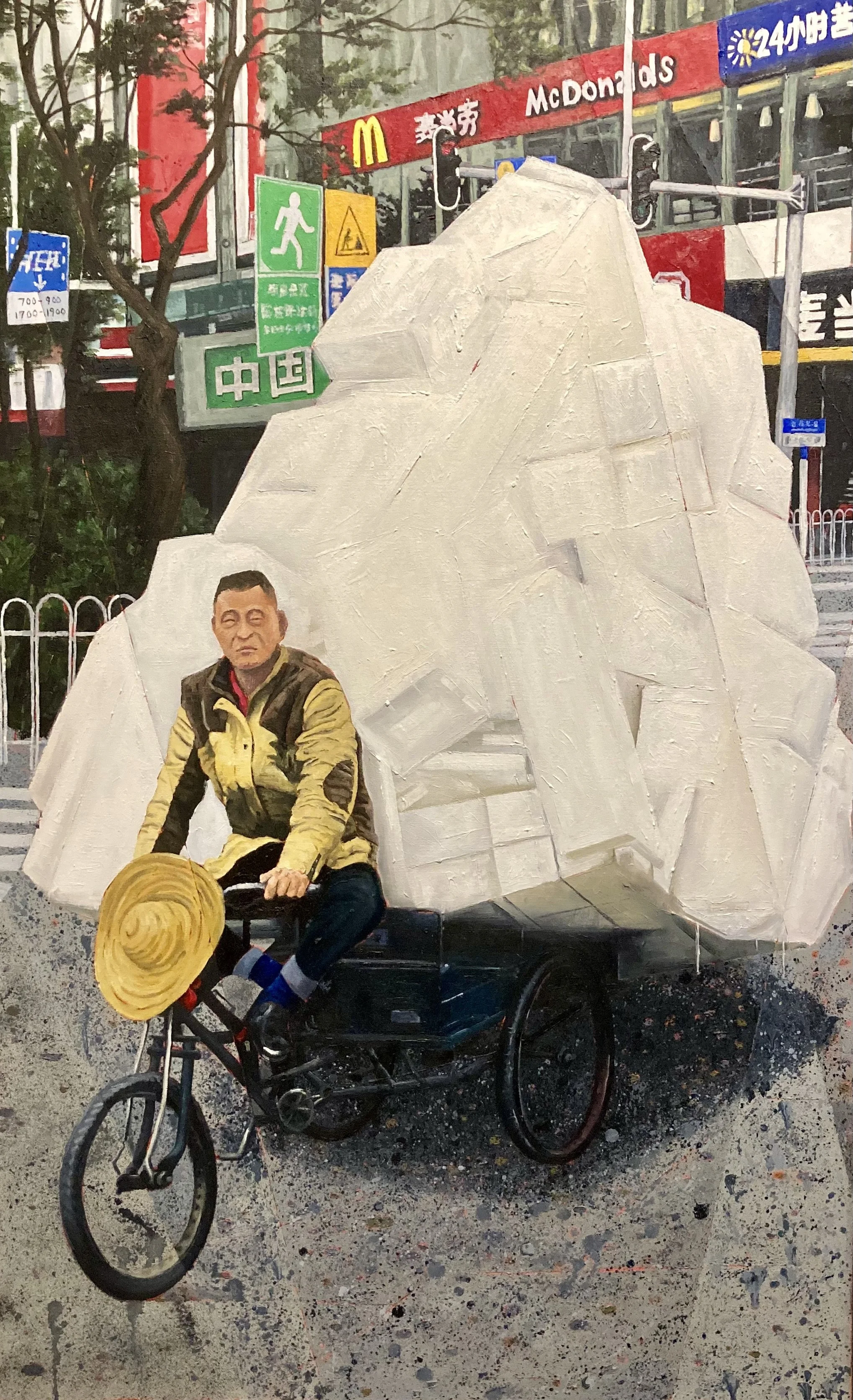
Peter Holton
Much of my more recent subject matter is based around my experiences travelling, encountering new things that initially seem almost surreal because they are so far from anything that you have known previously. - PH
Work: ‘Dragon Cave’ © P Holton - SOLD

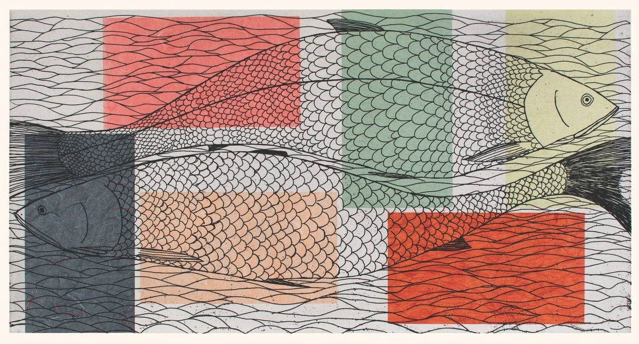
Phil Goldsmith
In both my linocutting and watercolours, my approach is fairly straight forward: I look for beautiful scenes, relationships, colours and patterns in our everyday world. Sometimes these are found in a scene and other times in details. These moments or scenes are ephemeral and often not seen in the hurly burly of life. - PG
Work: ‘Milkweed Gone To Seed’ © P Goldsmith

Stephen Snider
For an illustrator who is used to doing a lot of detail for the art director/client, becoming looser as a painter is always a challenge. If you want to be looser in the paintings you have to work at it more and learn to simplify scenes, the buildings, trees, people…everything. They’re more fun to paint in the long run. - SS
Work: ‘Furby House Dog Walk’ © S Snider - SOLD

Sue Wilkins
With past and current works, I focus on evoking stillness or tranquility. I would hope the viewer feels drawn into the painting and comfortable to stay awhile, finding passages within that resonate with them personally. Even with a storm-threatening sky there can be a peaceful stillness. This is where I am most comfortable myself, so it is natural I put this quietude into my paintings. - SW
Work: ‘What a Day’ © S Wilkins - SOLD

Wrex Roth
Having a background in architecture, I’m attracted to cityscapes. A big advantage, I believe, is my understanding of perspective, but most important is the composition of harmony and conflict together. - WR
Work: ‘Port Hope Crossing’ © W Roth - SOLD

Michael Everett Glover
I generally find my subject matter by exploring new places, travelling roads that I haven’t yet driven. This is one of the many reasons that I absolutely refuse to travel anywhere by air… I never paint anything that I haven’t been personally involved with, a place that I haven’t visited.
- ME
Work: ‘Old Boy’s Club’ © M Everett
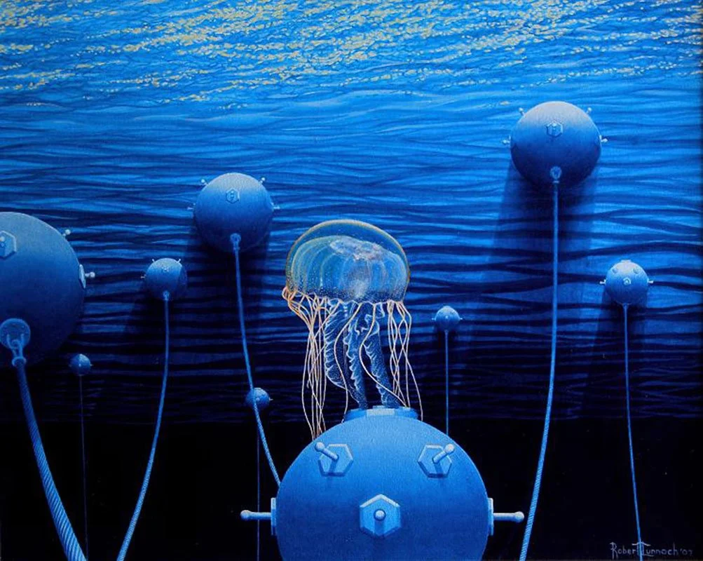
Bob ‘Omar’ Tunnoch
The natural world has always fascinated me, ever since I was a kid. Watching how we have become so disconnected from our environment is disturbing to me. By showing audiences certain remarkable lifeforms, along with the relationship we currently have with them, it makes me hopeful that people will search for a deeper understanding and respect for the world around us. - Omar
Work: ‘Eco Tourism’ © B. Tunnoch - SOLD

Frances Ferdinands
I come from a tropical country - Sri Lanka. Colour is in my blood, one might say. Colour to me also conveys joy, which is important more than ever now. Colour is an important element not only in South Asian culture, but in Middle Eastern culture, so my pattern sources from temples or mosques are very colourful. I see colour as a political statement as it asserts the rich heritage of these cultures, as well being life-affirming. - FF
Work: ‘No Fixed Address’ © F Ferdinands

Murray Sager
First I print, then I ponder. Then realize what it is or what it reminds me of. My piece “Zero Rock" is named after an actual place. Zero Rock is between Vancouver Island and the American Gulf Islands, right on the border. We dove there: dark grey winter day above, brilliant colours below the surface and the print reminded me of that. It could just as easily have been titled something like "Spring rain over Abergavenny”.
- MS
Work: ‘Untitled’ © M Sager - SOLD

William Tomlinson
People have always interested me more than any other subject matter. Landscape, abstraction and still life may provide equal range for the use of form and design in the service of beauty and expression, but because we naturally identify with people who are the subject of paintings, I think the expression is more powerful and personal. The beauty of the human figure, and especially the nude, touches us more deeply and personally. No matter who I am painting, nude or clothed, the human relations established between artist and model are very important to me. I have never been able to bring myself to do a drawing or painting of someone I dislike. - WT
Work: ‘Blind Woman + Blowing Curtain’ © W Tomlinson

Peter Haller
Simplicity of form and line in space has always excited me. The principles and criteria central to my work are contrast, form and rhythm. Descending, ascending and intersecting lines meet together: Movement and vibration are kept by the collectiveness and silence of the surrounding space through reduction to simple elements.
Work: ‘Cutline #10’ © P Haller - SOLD

Michiko Nakamura
When creating, I search for an unseen form in accordance with my sensibility. I used to be a designer. First, you start with a drawing and then the technical part follows. In my work now, I have to feel for it. I don’t know how a sculpture will look. I have to find how it a little bit at a time. The more I work on it, the more I can see what the sculpture will be. I get excited the closer I get. I want the sculpture to release itself. When I find it, I know the work is complete. - MN
Work: ‘Untitled Sculpture’ © Nakamura - SOLD

Deborah Uman-Sures
There’s a story in every face, gesture, texture and colour. Deborah’s work captures and holds the attention of many unsuspecting browsers. When asked what they see, the answer is always different and unexpected. - GS
Work: ‘Jaune’ © Uman-Sures

Barbara Buntin
There is a kind of alchemy in transferring an image from one surface to another. Wonderful layers of texture and mark making can be achieved in ways that aren’t always present with painting.
I use a sheet of glass as my work surface, rolling printing ink onto the glass. I use various tools to texture the inks, use hand cut stencils to block out a pattern, add additional colours or wipe sections away. I then lay paper onto that ink layer to pick up a print. There may be some ink left on the glass to make a second, or ghost print, but each one is unique and exact multiples aren’t possible with this method. - BB
Work: ‘Shrouded Shore’ © B Buntin
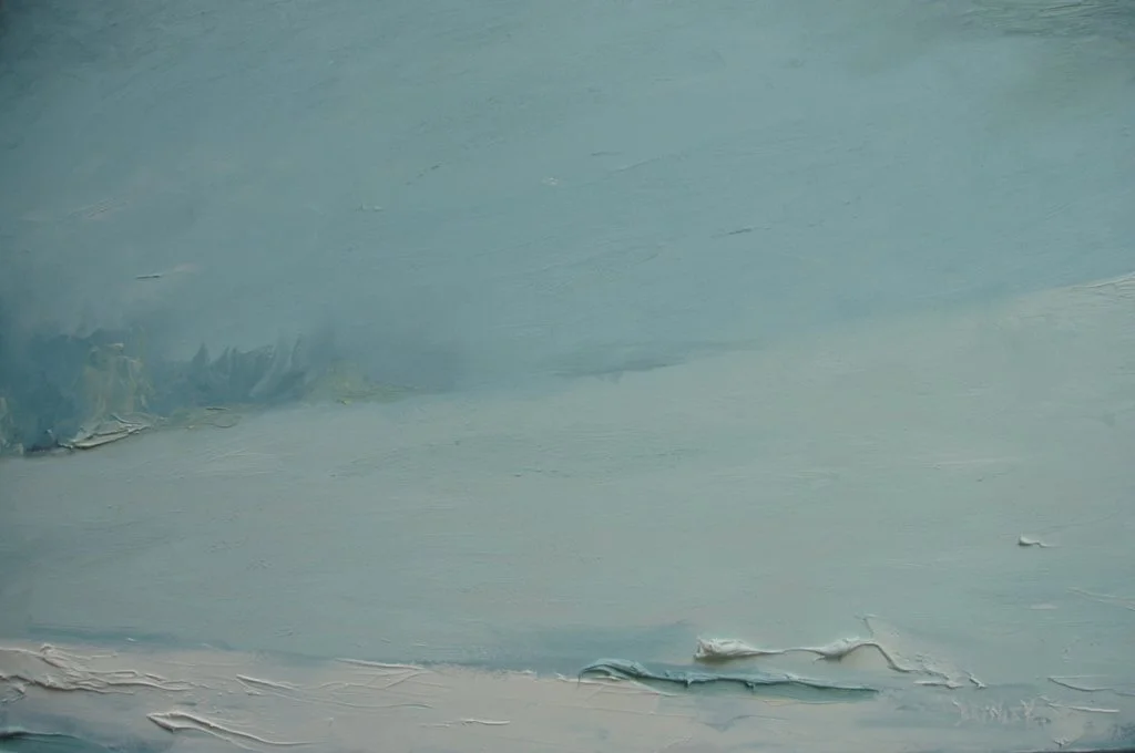
Brynley Longman
My work is created with two ranges in mind: from a distance the work has a cohesive image but they are also meant to be viewed up close where the thick impasto brush strokes create an almost abstract landscape. This allows the eye to move over and appreciate the shapes and colours within, moving from the macro view to a micro one. - BL
Work: ‘Snow Mist’ © B Longman